
Client Portfolio
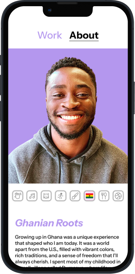
A portfolio for a Software Engineer to show off his personality and work experience. Through several iterations of design and testing, we worked together to create a unique final product. Final designs were created for both web and mobile, and my client plans to code the designs using React.
Overview
I designed a website portfolio and mobile version for a Software Engineer looking to capture his personality and work experience in a site. The client’s uniqueness drove the design of the site, with his continual input and user testing bringing us to a final Figma design that he later coded into a functional portfolio.
Problem + Goal
Software Engineers are notoriously pictured as coding robots, and my client wanted to break the stereotype by highlighting all of his interesting hobbies and skills that extend beyond work. The design goal was to be as creative with the design as my client feels he is as a person while still maintaining simplicity and an intuitive user experience.
-
Role
Product Designer
-
Tools
Figma, Procreate
-
Skills
UX Research, Visual Design, User Testing, Animation, Wireframing, Prototyping
-
Timeline
Dec–Feb 2025 (6 weeks)
Client Interview Takeaways
Question 1: What do you want your peers looking at your portfolio to know about you?
Question 2: What are your special interests?
Focus on his personal hobbies and life outside of work.
Highlight his individuality and mind.
His aesthetic is minimal and clean, with a love for pastels.
User Interview Takeaways
Question 1: Have you ever looked at another software engineer’s portfolio? If so, why?
Question 2: What might you hope to find on someone’s portfolio?
Question 3: What factors do you use to gauge if you think you would get along well with someone (through the internet)?
100% of users said they want to learn more about a person’s interests outside of work.
83% of users mentioned wanting a way to connect further with a person through their portfolio.
50% of users stated a person’s appearance/demeanor as a way to learn more about them.
The user interview takeaways led me to link the client’s LinkedIn in the site footer, influenced my decision to create an interactive GIF from the client’s headshot, and confirmed our emphasis on hobbies would be engaging.
Personas
I wanted to form a deeper understanding of our users' goals, needs, experiences, and behaviors. So, I created 2 personas— the employer and the onlooker. The onlooker persona was strengthen through user interviews where users spoke about their motivations for looking at a peer’s portfolio. I used these personas whenever I needed to step out of myself and reframe my mind from the perspective of the user.


Moodboard

Wireframes
Using Figma, I flowed through several iterations of a single page. Doing so helps me work out the layout and composition and experiement with the design. I keep this phase of the process exploratory and I’m able to get a visual idea of what’s working and what’s not.


Iterations for the layout of the “About” page hobbies.
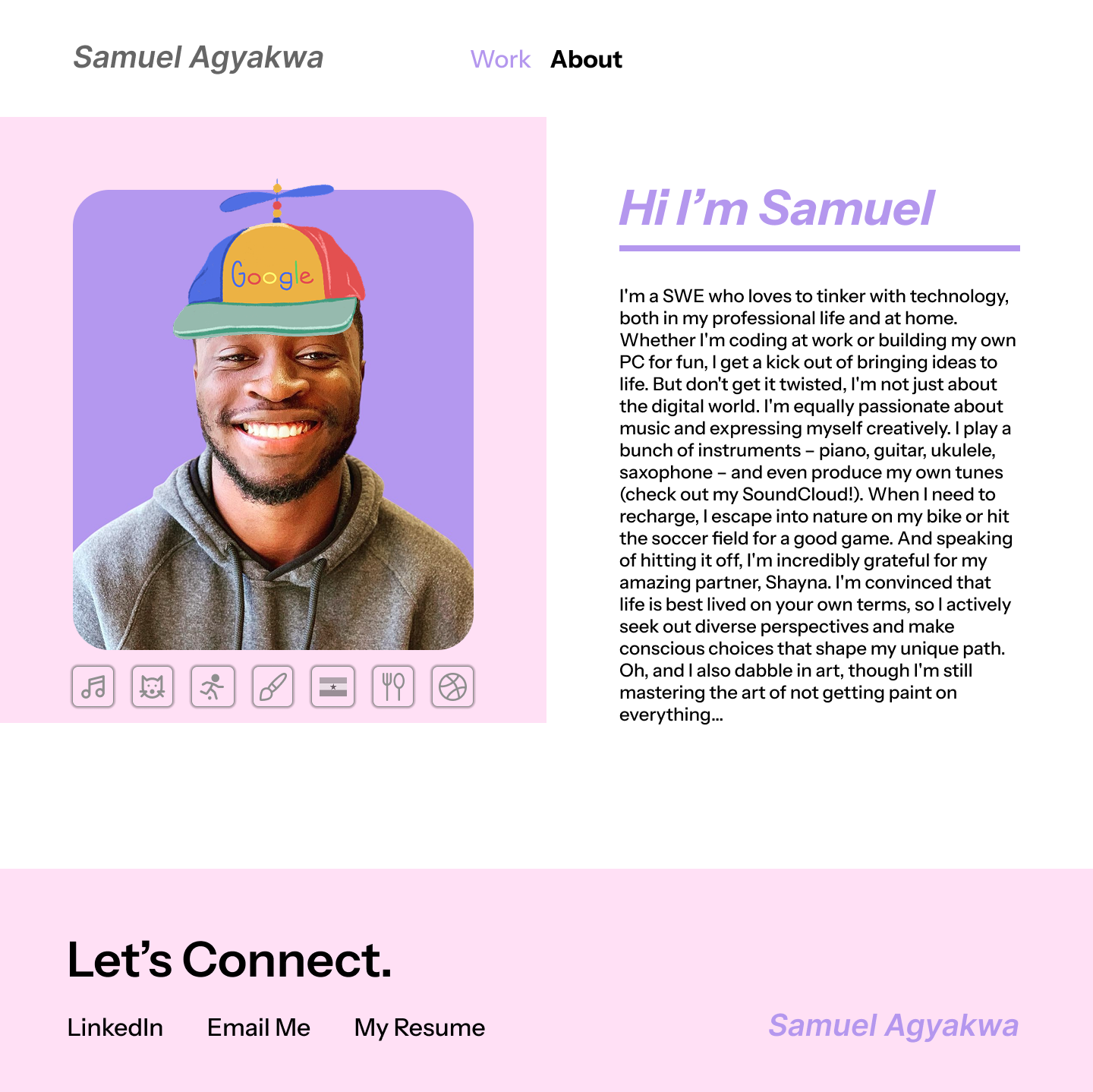
After interviewing my client and learning how fun + personality focused he wanted his portfolio to be, I kept coming back to the concept of wearing many hats. My client had six main hobbies he wanted to share with viewers. I drew each one of these hobbies a “hat” to place over his headshot, and stitched them together to create an animated GIF. When the viewer selects which hobby they want to read about the GIF pauses on the matching hat for a fun and interactive display of his many talents.


What was shown to my client, v.s. the suggestion he made to make the buttons more distinguishable.

Final layout and design for the “About” page hobbies.

Usability Testing
After presenting mid-fi wireframes to my client to gauge his thoughts, I created a high-fi prototype of our design. I tested the prototype on 3 users. Their task was to “Find out what Samuel likes to cook.” Each user navigated easily to the About menu tab, and clicked on the food icon button with 5-20 seconds hesitation. One user mentioned he was “pretty sure” they were buttons, but that he would have felt more confident if one was already shown as being selected.
This led me to clarify the design further by adding an additional button that would be preselected with a wave icon.
Before:
After:

UI Design
I produced final designs for both web and mobile. The final look is clean, minimal, and fun. The final look of the hobby buttons and hats is playful and engaging. Link to Prototype.


“I had a pretty clear vision in my head for what I wanted - clean, modern, and showcasing myself in the truest possible light - but even when I struggled to articulate something, she would get it immediately and bring that idea to life. It felt like a truly collaborative process, and I'm thrilled with the results.”
-Samuel Agyakwa, client
Learnings
Your best idea usually isn’t your first idea. Doing several iterations of a single page really strengthened my final design.
Having frequent check-ins with my client throughout the project helped him feel comfortable, listened to, and valued making it a truly collaborative process.
My client plans to code the portfolio using React. Figuring out the end goal of how the website would be hosted and built after the design was created allowed the design to have more freedom.