
Tidy Events Mobile App Concept, Research, + Design
An organizational tool for small business owners.


Overview
From concept to prototype, I designed an app called Tidy Events for small business owners who participate in art markets to stay organized. I conducted user interviews, developed personas, designed wireframes, and built a prototype.
Problem + Goal
Being an entrepreneur forces you to juggle a lot of tasks, and feeling disorganized can turn that work load from managable to overwhelming and frustrating. The Tidy Events app concept is designed to streamline event organization by keeping your deadlines all in one place, tracking your success at each event, and informing you about the events that are ideal for you.
-
Role
Product Designer
-
Tools
Figma, Prototype
-
Skills
UX Research, Visual Design, User Interviews, Branding, Cart Sorting, Wireframing
-
Timeline
Aug–Nov 2024 (12 weeks)
User Interviews
During the ideation phase of the project, I conducted user interviews to build new personas and to inform the design off my app. I prepared an interview script with 10 open-ended questions, focusing on the target audiences’ needs, motivations, and relationship with art markets. I recruited and interviewed 5 small business owners from my social media network remotely through Zoom.
I went into the interviews with a different app concept than I emerged with. My initial idea was to create an app that served as an event finder for vendors. However, after my interviews I discovered a common need amongst users that was greater than finding events—tracking them.
Many vendors participate in recurring markets, decreasing their need to find events.
"I know the big markets. Everyone talks about them, it's hard to miss." - User 1
"I try to write market dates in my calendar. I'm trying to get better about that." - User 2
The user interviews allowed me to get to know my target audience better, and pivot to meet their needs.
Personas
I wanted to form a deeper understanding of our users' goals, needs, experiences, and behaviors. So, I created 2 personas for our main target user and a secondary user. They were developed based on the user interviews, and I drew the character illustrations using Procreate. I used these personas whenever I needed to step out of myself and reframe my mind from the perspective of the user.


Customer Journey
I created a customer journey map to build a better understanding of how customers find and interact with the service and to discover opportunities for improvement. During this phase, I began thinking about opportunities that could elivate customer pain points such as being able to seamlessly transfer information from an existing spreadsheet, or making sure the app has clearly defined features so there is no hesitation to download.

Card Sorting
To make sure that the site’s information architecture is aligned with user expectations, I conducted 17 open card sorting sessions using the online platform Optimal Workspace. My goal was to find intuitive groupings for the existing 11 product categories, and confirm that my initial naming made sense. After organizing the data, I learned that users were associating "Upcoming Events" as a public category rather than their own upcoming events. This led me to use "My" language to label product categories that pertained specifically to the user's events.

Sketches
I began the design process with pen and paper to snowball my ideas out of my head and onto a page. My sketches were inspired by apps I use frequently such as Venmo and Class Pass. I began brainstorming the navigation bar icons, the app's most crucial content that deserves a spot on the home page, and how to intuitively take a user through the flow of adding a new event. These sketches guided my low fidelity wireframes as I moved back to Figma.

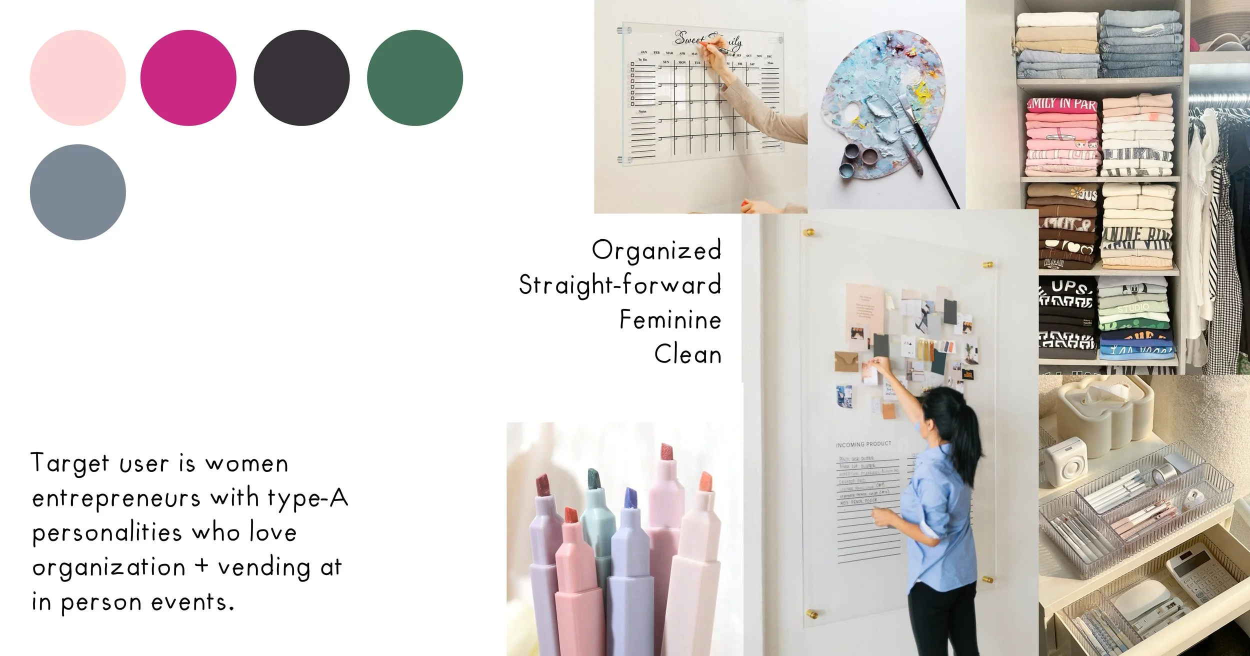
Moodboard
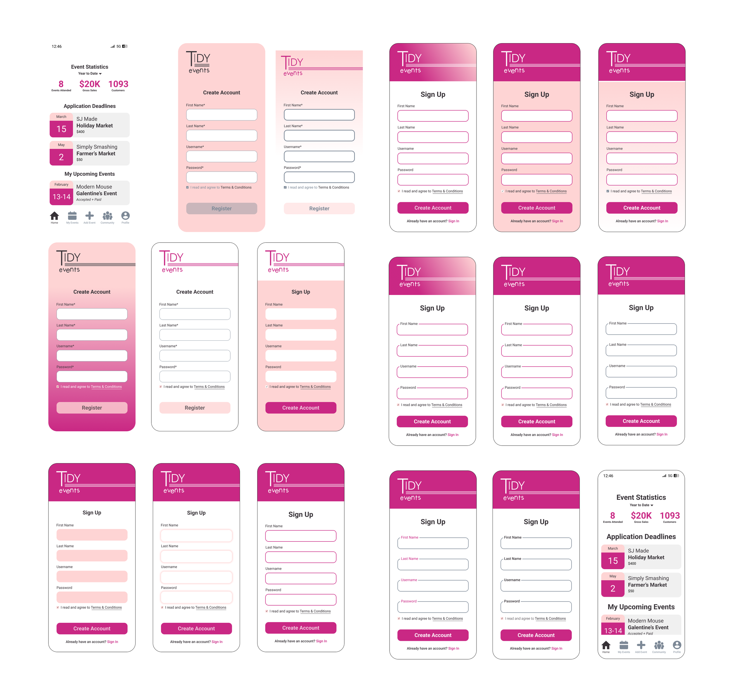
UI Design
With the edge cases in mind and layout established, I moved on to design the final screens in Figma. My goal was to create a visual identity that felt clean, approachable, and fun. I used a contrast checker to be sure all of the app's colors and text meet accessibility guidelines, and implemented subtle animations into the app's functionality.


Through interviews and research, I listened to the small business vendor community to develop an app concept that meets users' needs.
Learnings
I began my app concept with the notion that because I belong to the demographic of my target user, I would be able to intuit their needs and desires. My first conduct of research, the user interviews, quickly taught me to toss aside my assumptions and be ready to listen and learn.
This project also increased my comfortability with creating a pixel-perfect UI using Figma. I utilized intervals of 8's to create visual harmony, considered the line weight of my icons to create cohesion, and discovered a new tool for checking color contrast to ensure accessibility needs are met.