
Elite Pharmaceuticals Redesign
A minimal and modern redesign that matches ELTP’s website with their mission and innovation in the technology space.

Overview
A website redesign of Elite Pharmaceuticals Home Page and Investors Page using Figma. Formed through competitive research, user interviews, and user surveys. The redesign elevates the company’s website to better represent their innovation and importance in their industry.
Problem + Goal
Elite Pharmaceuticals is a leading company when it comes to medicine and technology, yet their website is outdated and lacking a clear message. The goal with my redesign was to make their mission statement undeniable, give current and potential investors all of the neccessary information, and leave users feeling confident in their brand.
-
Role
Product Designer
-
Tools
Figma
-
Skills
UX Research, Visual Design, User Testing, Branding, Wireframing
-
Timeline
2 weeks

ELTP’s home page before.
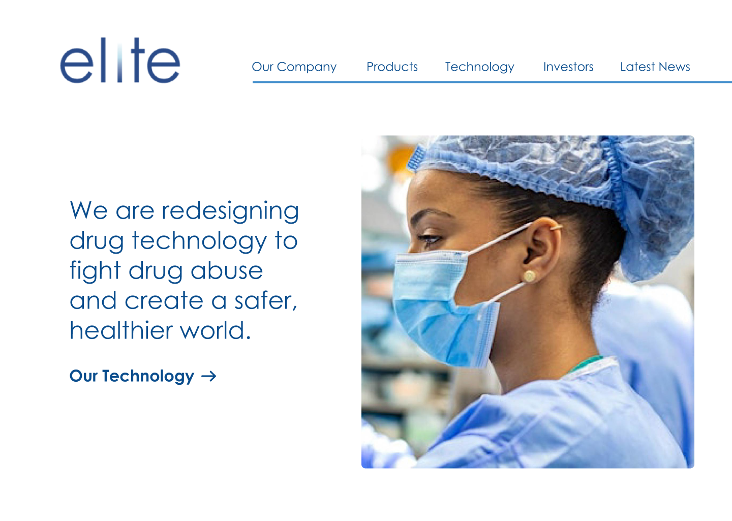
ELTP’s home page after the completed redesign.
Competitive Research
Company 1, Teva Pharmaceuticals
Strengths
The opening videos on the home page of the website showcase their mission statement well: “We are all in for better health.” They give the website a warm + human first impression.
As you scroll you are given an up arrow in the bottom right corner to return to the top of the page.
Accessibility icon.
Weaknesses
The imagery is a nice addition, but some photos look a little too photoshopped. Also, there are a few images used multiple times throughout the website as thumbnails, but the same image leads to different pages.
Opportunities
“Our Impact” page has really fun branded illustrations. More of these throughout the website would have been really cool and made them seem less random.
Competitive Analysis was performed on 3 companies: Teva Pharmaceuticals, Lilly, and Johnson&Johnson.
User Interviews
Interview Questions
What information do you look for before investing in a company?
What information would you expect to find on a company’s website for investors or potential investors?
Are you signed up for any investor email newsletters with your current investments?
Can you use a few adjectives to describe the companies you have investments with?
User Answers
I look at their current cash flow and profits for the year we’re in, and quarter over quarter revenue. I look at the products to see how practical and how viable the product is in their current market space. Who their competitor is in that space and their revenue quarter over quarter. The volume of the stock and how much interest there is in the stock. I listen to their latest investor relations video or earnings call from the CEO.
I would love to find a link to the latest earnings call, all their SEC filings, and the current price of the stock, and a graph of the current year we’re in showing the stock’s growth. I would probably want some deep dive article about the product and how it’s made and any expansion plans.
Yes of course why wouldn’t I be.
Ambitious, ground-breaking, and practical.
Personas
I wanted to form a deeper understanding of our users' goals, needs, experiences, and behaviors. So, I created a persona—a potential ELTP investor—informed by the above user interviews.

Moodboard

Wireframes
I created a series of low-fidelity wireframes to get an idea for the home page layout, structure, and typography.


User Survey
Once I had my two strongest home page designs, I gathered feedback from 45 people on which design they preferred. 71% favored Design A.

Design A

Design B

ELTP’s Investors Relations page design before.

ELTP’s Investors Relations page after the redesign.
I redesigned ELTP's website to ensure it stays up-to-date and better represents the company as a professional leader in their industry.
Learnings
Even when you think you know someone’s answer, it’s better to ask. The user interviews were invaluable during this redesign and truly helped me understand the needs a prospective investor. My user survey regarding the design of the company home page also went against my expectations. I am learning it is best to detach yourself from your designs to a degree, and let the research speak.